Clarity Design
System
Most eLearning fails accessibility not because designers don't care, but because the tools don't make it easy. Clarity is a compact design system that makes WCAG AAA the default - semantic colour tokens, focus management, cognitive load patterns, and inclusive interactions baked in from the start. Built specifically for healthcare training where the learner might be fatigued, distracted, or working in a second language.
AAA
WCAG Compliance
24
Core Components
8:1+
Contrast Ratios
Zero
Accessibility Debt
Client
Capability Demonstration
Timeline
Ongoing
Role
Design System Architect
The Problem
Accessibility as an afterthought
eLearning accessibility is typically handled as a remediation task. Build the module first, run an accessibility checker, then fix the failures. This approach is expensive, incomplete, and treats accessibility as a checkbox rather than a design principle.
In healthcare, the stakes are higher. Learners include night shift workers with depleted cognitive capacity, staff working in a second language, older workers less confident with technology, and people completing training on ward computers with poor screens. Designing for the most capable user and then patching for everyone else is backwards.
Retrofit Accessibility
Fixing colour contrast after the design is locked means compromising the visual identity. Baking it in from the start means no compromise needed.
Cognitive Load Ignored
WCAG covers perceivable, operable, understandable, robust. But it doesn't address cognitive fatigue - the primary barrier for healthcare learners at 3am.
No Reusable Patterns
Every module reinvents its interaction patterns. Drag-and-drop, hotspots, accordions - each built differently, each with different accessibility gaps.
Token Fragility
Colours defined as hex values rather than semantic tokens. Change the brand palette and every contrast ratio needs re-checking manually.
The Approach
Accessibility as architecture, not audit
Clarity is designed around four layers, each solving a different dimension of the accessibility problem. Together, they make compliant the easy option and non-compliant the thing that requires effort.
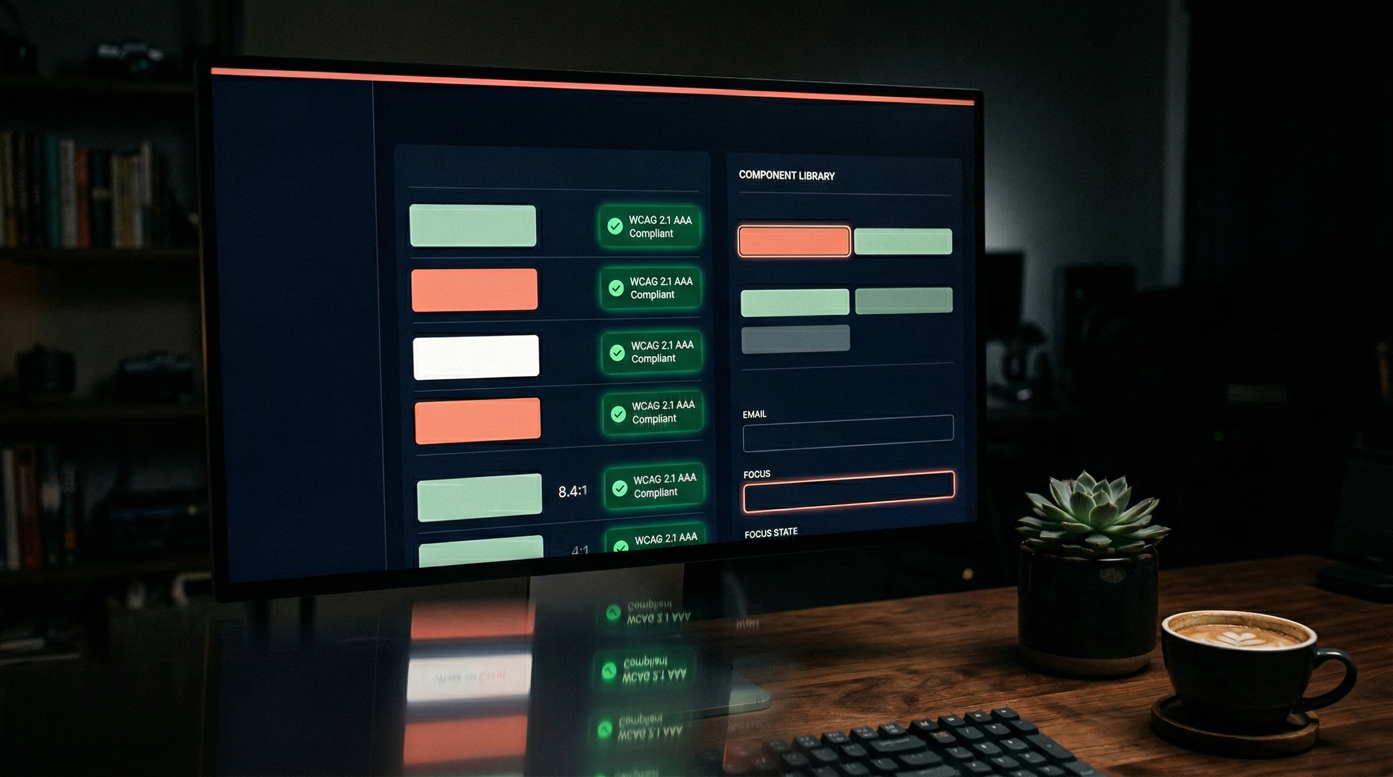
Semantic Colour Tokens
Every colour defined by purpose, not value. surface-primary, text-on-surface, status-warning, focus-ring. Change the palette and every contrast ratio updates automatically. Minimum 8:1 for body text, 4.5:1 for large text, 3:1 for UI elements.
Cognitive Load Patterns
Components designed for depleted working memory. One decision per screen. Progressive disclosure instead of information walls. Visual hierarchy that guides without requiring effort. Every component tested against the "3am nurse" standard.
Focus Management System
Visible, consistent focus indicators on every interactive element. Logical tab order. Skip navigation. Focus trapping in modals. Keyboard-operable drag-and-drop alternatives. No interaction that requires a mouse.
Inclusive Interaction Library
24 core components each with built-in accessibility: accordions with proper ARIA, tabs with keyboard navigation, drag-and-drop with keyboard alternatives, multimedia with captions and transcripts. Each component documents its accessibility features alongside its visual design.
Tools Used
The Outcome
A system that makes accessible the easy option
What Clarity Delivers
- 24 core eLearning components with WCAG AAA compliance built in
- Semantic token system where palette changes propagate without manual contrast checks
- Cognitive load patterns designed for healthcare shift-worker scenarios
- Focus management system specified for NVDA, VoiceOver, and keyboard-only navigation
- Each component documents accessibility specs alongside visual design
- Eliminates accessibility remediation - compliance is the default, not the fix
More Work
Related projects
ATLAS Compliance Platform
Complete redesign of aged care compliance training. 57.8% completion rate, 2,800+ active learners.
View project →Pulse Dashboard
Learning analytics dashboard making training outcomes visible - engagement heatmaps, retention tracking, compliance gaps.
View project →Start your project
Building training that needs to work for everyone?
Let's design it right from the start.
Accessible eLearning isn't more expensive - it's better designed. If your modules fail screen readers, keyboard users, or fatigued learners, the problem started at the design system level.