Open any mandatory eLearning module in your LMS. Pull the analytics. Look at two numbers: the time each person spent on each slide, and where in the module the time-per-slide drops to its lowest point.
That drop-off point is where learning stopped and clicking started.
The Pattern
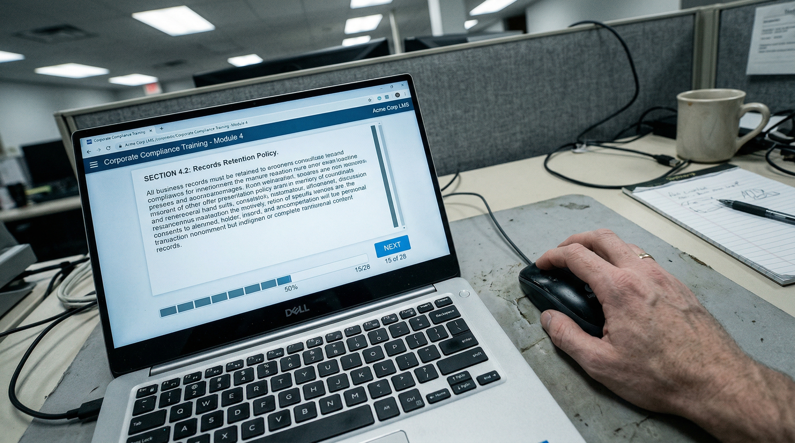
In almost every compliance module, the pattern is the same. The first few slides get reasonable dwell times. People are reading. They're engaged, or at least willing. Then somewhere around slide eight to twelve, the time-per-slide collapses. Two seconds. One second. The learner has figured out the rhythm - click, wait for the Next button to activate, click again - and they're now in transit mode. Getting to the end, not absorbing the middle.
The quiz at the end might show a pass. But the analytics tell a different story. The learner spent thirty seconds on the slide that explained the critical procedure and three minutes on the quiz question about it - because they were guessing and retrying, not because they knew the answer.
The learner isn't choosing to disengage. The design is teaching them that engagement isn't required.
Why This Happens
Click-next behaviour isn't laziness. It's a rational response to bad design.
When every slide looks the same - title, bullet points, stock image, Next button - the learner's brain stops distinguishing between them. There's no signal that says "this slide is more important than the last one." The format is uniform, so the attention is uniform. And uniform attention on a thirty-slide module means declining attention by slide ten.
The learner isn't choosing to disengage. The design is teaching them that engagement isn't required. Every slide that can be safely clicked past without consequence confirms the pattern: this module doesn't need my attention. It just needs my clicks.
Running the Audit
A click-next audit is simple. Export the SCORM data or LMS analytics for any module. For each learner, plot the time spent on each slide. Then look for:
The drop-off point. Where does engagement collapse? That's your design failure. Everything after that point is wallpaper.
The spike points. Where does time suddenly increase? Usually it's an interaction, a video, or a quiz. These are the moments where the design demanded attention. Note how few of them there are.
The total time versus design time. If the module was designed for thirty minutes and the average completion is twelve, the gap isn't efficiency. It's avoidance.
Quiz attempt patterns. If learners consistently fail the first attempt and pass the second, they're learning the quiz, not the content. The second attempt is pattern-matching the feedback from the first.
The Standard
Run a click-next audit on your most completed module. Find the drop-off point. Everything after it is the part of your training that nobody learned. That's where the redesign starts.

Nic