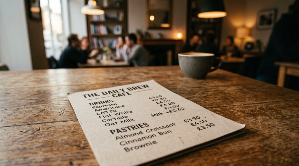
There was a cafe I used to go to most Saturday mornings. Nothing fancy. Good coffee, reliable eggs, one of those laminated menus with photos that probably hadn't been updated since 2019.
I loved it. Not because the food was extraordinary, but because it was easy. Walk in, sit down, scan the menu, order in thirty seconds. I knew what I wanted before the waiter got to the table.
Then one day I walked in and they'd renovated. New fitout, new branding, new menu. The menu was the first thing I noticed. Matte black card, tiny sans-serif font, no photos, no sections. Just a wall of text in lowercase with prices buried at the end of each line.
It looked incredible. Like something you'd see on a design blog. Beautifully minimal. I couldn't read it.
The Slow Bleed
The thing about bad design is that it rarely kills a business overnight. It's a slow bleed. People don't storm out because they can't read your menu. They just take longer to order. They feel slightly uncomfortable. They default to asking the waiter what's good instead of browsing. The energy shifts from relaxed to uncertain.
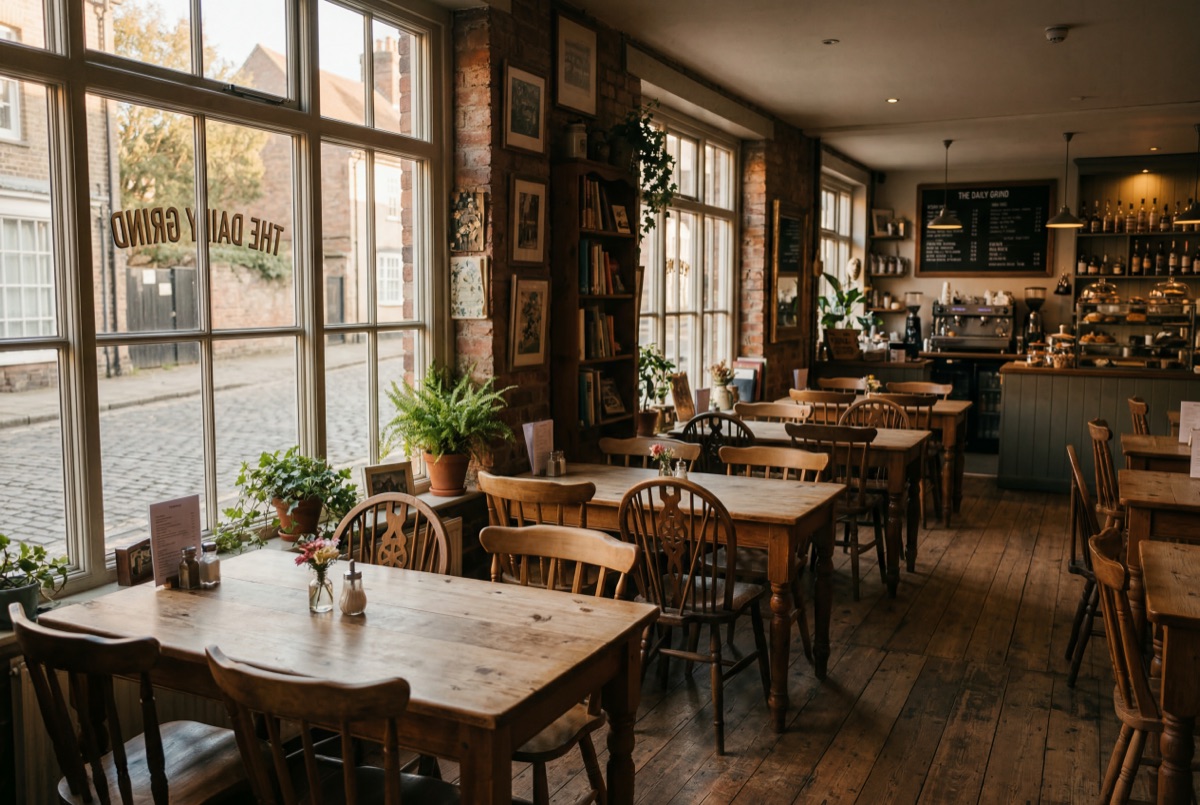
I watched it happen over weeks. The Saturday crowd thinned. Not dramatically, just enough to notice. The tables that used to turn over twice during brunch started sitting empty between seatings. The vibe changed. It went from buzzing to... fine.
Nobody said "I stopped going because the menu was hard to read." They just drifted. Found somewhere else. Couldn't quite explain why.
Every design decision is a business decision. That menu wasn't just a list of food. It was the most important sales document in the building.
A Menu Is a Sales Tool
Here's what most people miss about graphic design: it's not decoration. Every design decision is a business decision. That menu wasn't just a list of food. It was the most important sales document in the building.
Font size determines how quickly someone can scan options. Hierarchy tells people where to look first. White space gives the brain room to process. Grouping creates categories that make choosing feel manageable instead of overwhelming.
When you strip all of that out in the name of aesthetics, you haven't made a better menu. You've made a prettier obstacle between your customer and their money.
The old laminated menu with its daggy photos? That was doing its job beautifully. People found what they wanted in seconds. They ordered confidently. They added sides because the layout made it obvious. Design doesn't have to be beautiful to be effective. And beautiful design that doesn't work is just expensive wallpaper.
The Typography Tax
I call it the typography tax. It's the hidden cost businesses pay when they choose form over function. A font that's too small, too light, or too stylised costs real money. Not in printing costs. In lost orders, slower table turns, confused customers, and missed upsells.
A 14pt font with clear section headers and smart visual hierarchy won't win a design award. But it will sell more eggs benedict on a Saturday morning. And that's what a cafe needs.
Good Design Is Invisible
The best design doesn't make you think about the design. It makes you think about the food. Or the service. Or whether you want the big breakfast or the small one.
When design calls attention to itself, it's usually failing at its actual job. The cafe that redesigned their menu wanted to look premium. What they got was a beautiful barrier between their kitchen and their customers' wallets.
Design is not art. It's problem solving with aesthetics.
The Lesson
If you're a small business owner reading this, here's the takeaway: your designer should be asking about your customers, not just your colour palette. Every font choice, every layout decision, every bit of white space either helps someone buy from you or gets in the way.
Design is not art. It's problem solving with aesthetics. And when the problem is "help people choose and order food quickly," the solution is rarely a matte black card in 9pt Helvetica Neue Light.
That cafe closed about eight months later. I don't think it was just the menu. But I don't think the menu helped.

Nic Gallardo
Healthcare Instructional Designer - Perth, WA