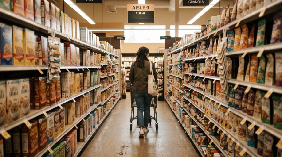
I was standing in Aldi last Tuesday, halfway down the cereal aisle, when I realised I was being designed.
I'd walked in for milk. Just milk. But somehow I was holding a bag of pistachios, a candle that smelled like sandalwood, and a cordless drill that was on special. The milk was at the back of the store. Obviously.
This isn't an accident. Every supermarket on earth puts the essentials at the back. Bread, milk, eggs. The stuff you actually came for. Because to get there, you walk past everything else. And walking past things is how impulse purchases happen.
I stood there holding my pistachios and thought: this is the best user journey I've ever experienced.
Everything Is a Journey
Here's what I've been sitting with lately: user journeys aren't a web design concept. They're a human concept. Every space you move through, physical or digital, is a path someone designed. Or didn't design, which is usually worse.
The Aldi store layout is deliberate. The entrance funnels you into the produce section. The aisles are narrow enough to slow you down but wide enough to feel comfortable. The Special Buys are right in the middle where you can't avoid them. Every metre of floor space is designed to keep you moving through the entire store.
Your website does the same thing. Or it should. The homepage is the entrance. The navigation is the aisle layout. The call to action is the checkout.
Every click is a step on a path that either leads somewhere useful or loses the visitor in the cereal aisle wondering how they got there.
The eLearning Version
This clicked for me even harder when I started thinking about eLearning. A training module is a journey too. The learner starts at the beginning and you need them to arrive at the end having actually learned something.
Bad eLearning dumps everything on screen at once. Here's the content, here's a quiz, good luck. It's like walking into a supermarket where all the products are piled in the middle of the floor. Technically everything is there, but nobody can find what they need.
Good eLearning designs the path. It sequences information so each concept builds on the last. It uses scenarios to create momentum. It puts the "milk" (the core learning objective) at the back, and fills the journey with meaningful stops along the way.
The learner doesn't just arrive at the destination. They arrive having picked up everything they need along the route.
Design the Path, Not the Destination
Most clients come to me focused on the destination. "I want a website that converts." "I need a training module that gets compliance done." "I want a brand that stands out."
Fair enough. Those are good outcomes. But outcomes don't happen at the destination. They happen along the path. A website converts because every page guides the visitor toward a decision. A training module works because the journey builds understanding step by step. A brand stands out because every touchpoint reinforces the same story.
The destination is just where the path ends. If you only design the destination, you're building a beautiful back wall in a store with no aisles.
The best UX insights come from paying attention to the physical world. Supermarket layouts. Airport wayfinding. How a good restaurant seats you near the window first.
Pay Attention to the Physical World
The best UX insights I've had didn't come from design blogs or conference talks. They came from paying attention to the physical world. Supermarket layouts. Airport wayfinding. How a good restaurant seats you near the window first and fills the middle tables later.
The principles are everywhere. Sequence matters. Friction is a tool, not just an obstacle. People follow paths of least resistance. The environment shapes behaviour more than the content does.
Next time you're standing in Aldi holding something you didn't plan to buy, ask yourself how you got there. Then apply that thinking to whatever you're designing.
I still bought the drill, by the way. It was a good deal.

Nic Gallardo
Healthcare Instructional Designer - Perth, WA