Back to all work
Brand Strategy Visual Identity Hospitality

Nourished Cafe

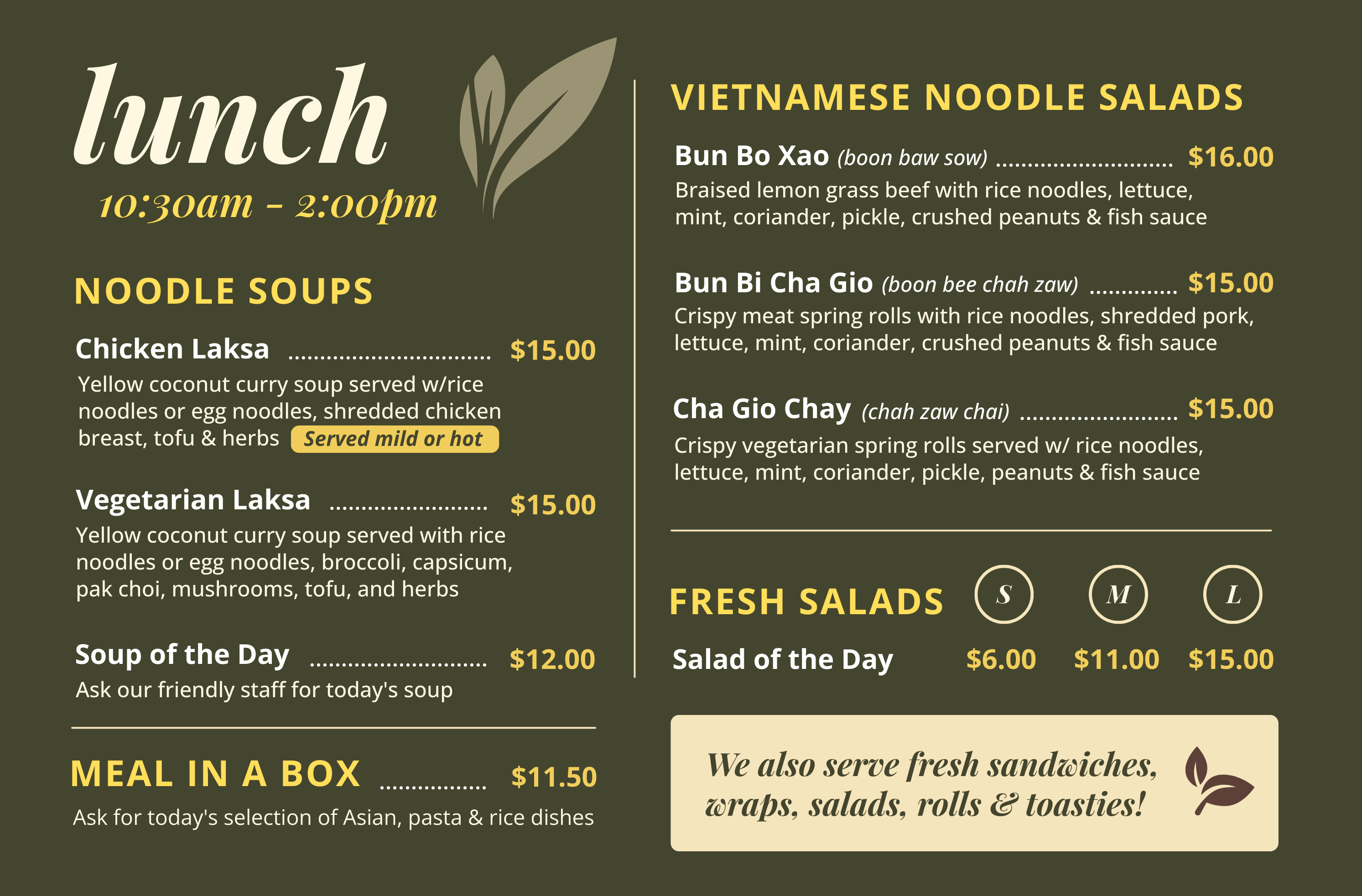
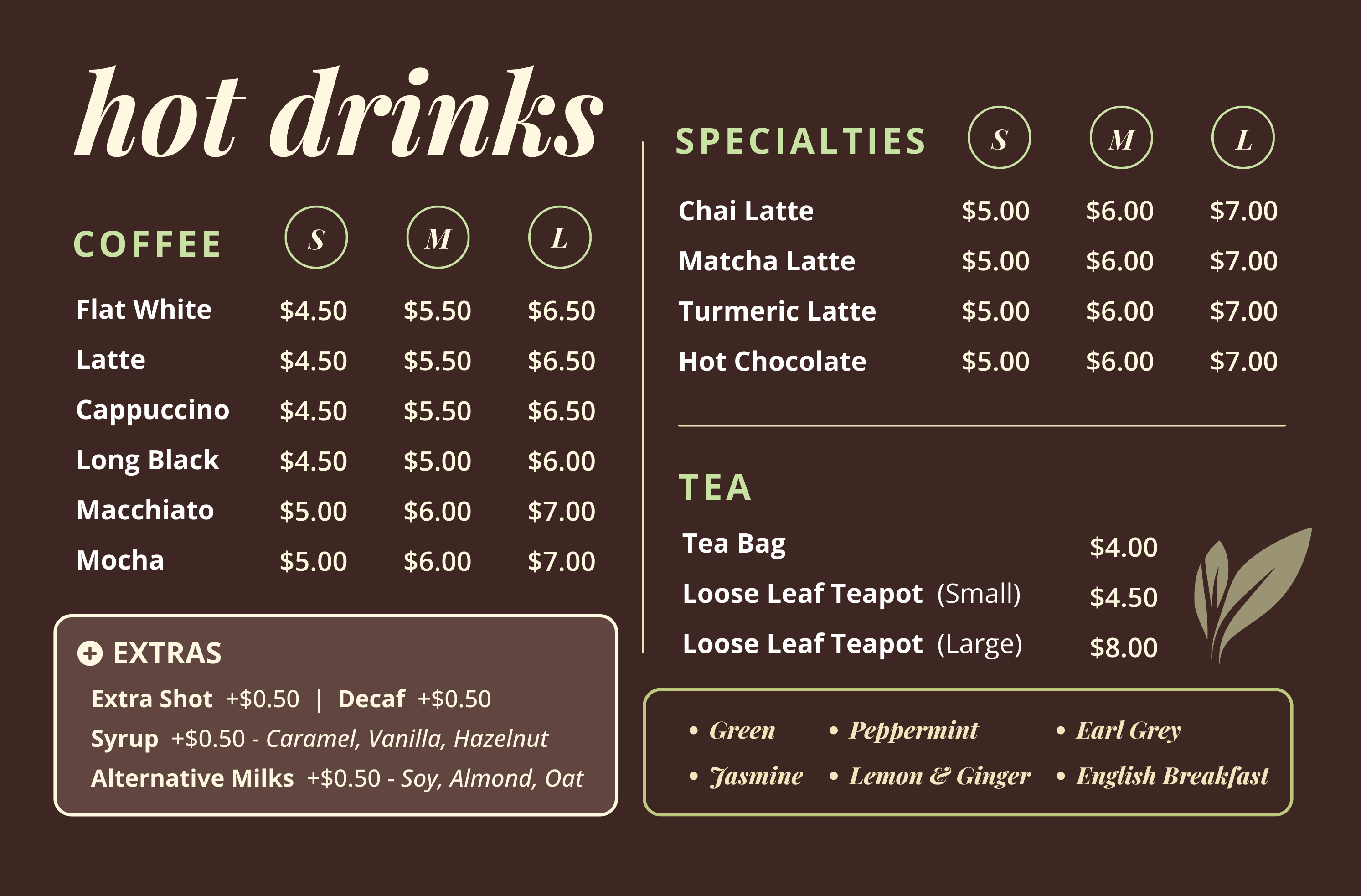
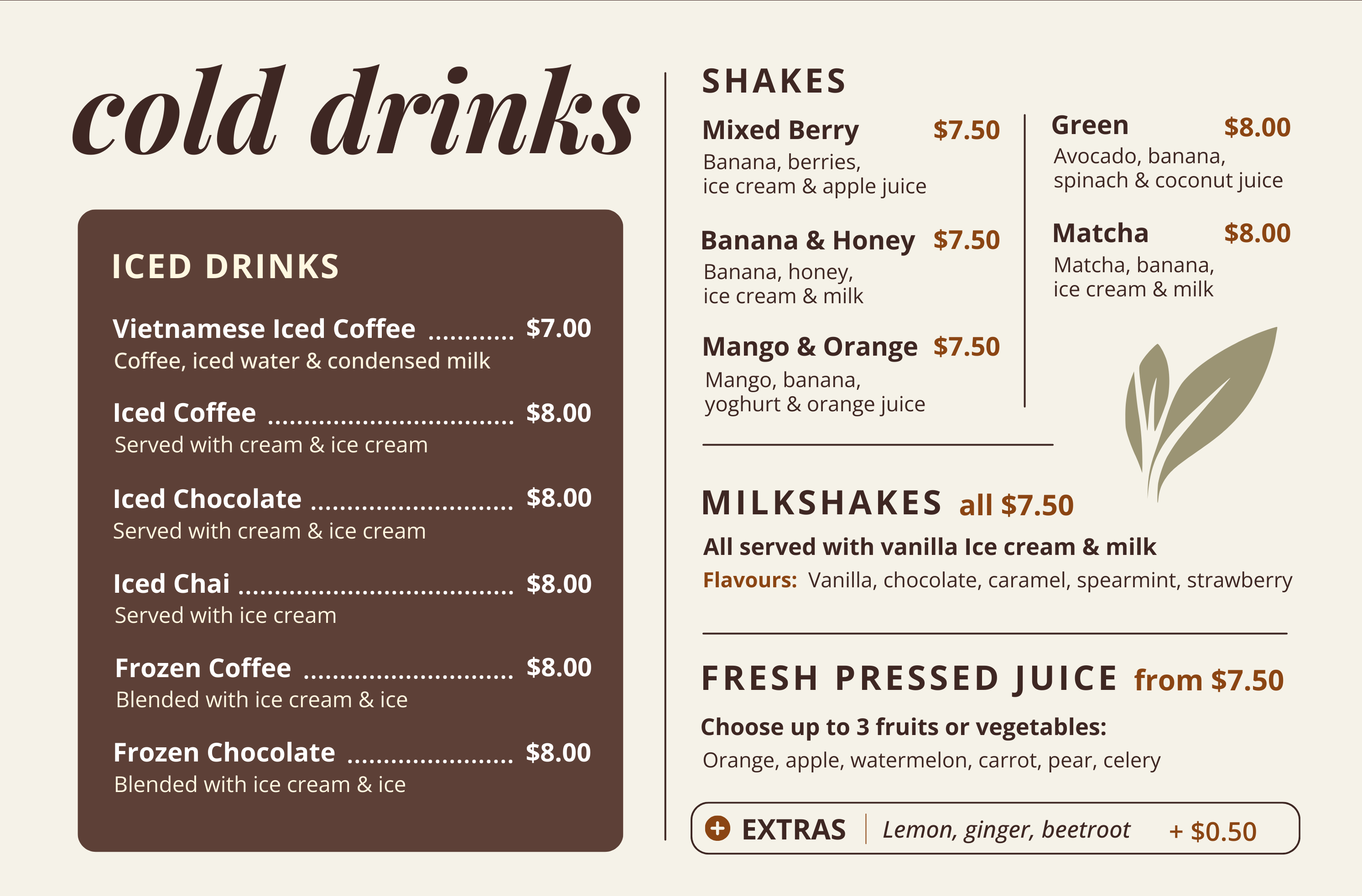
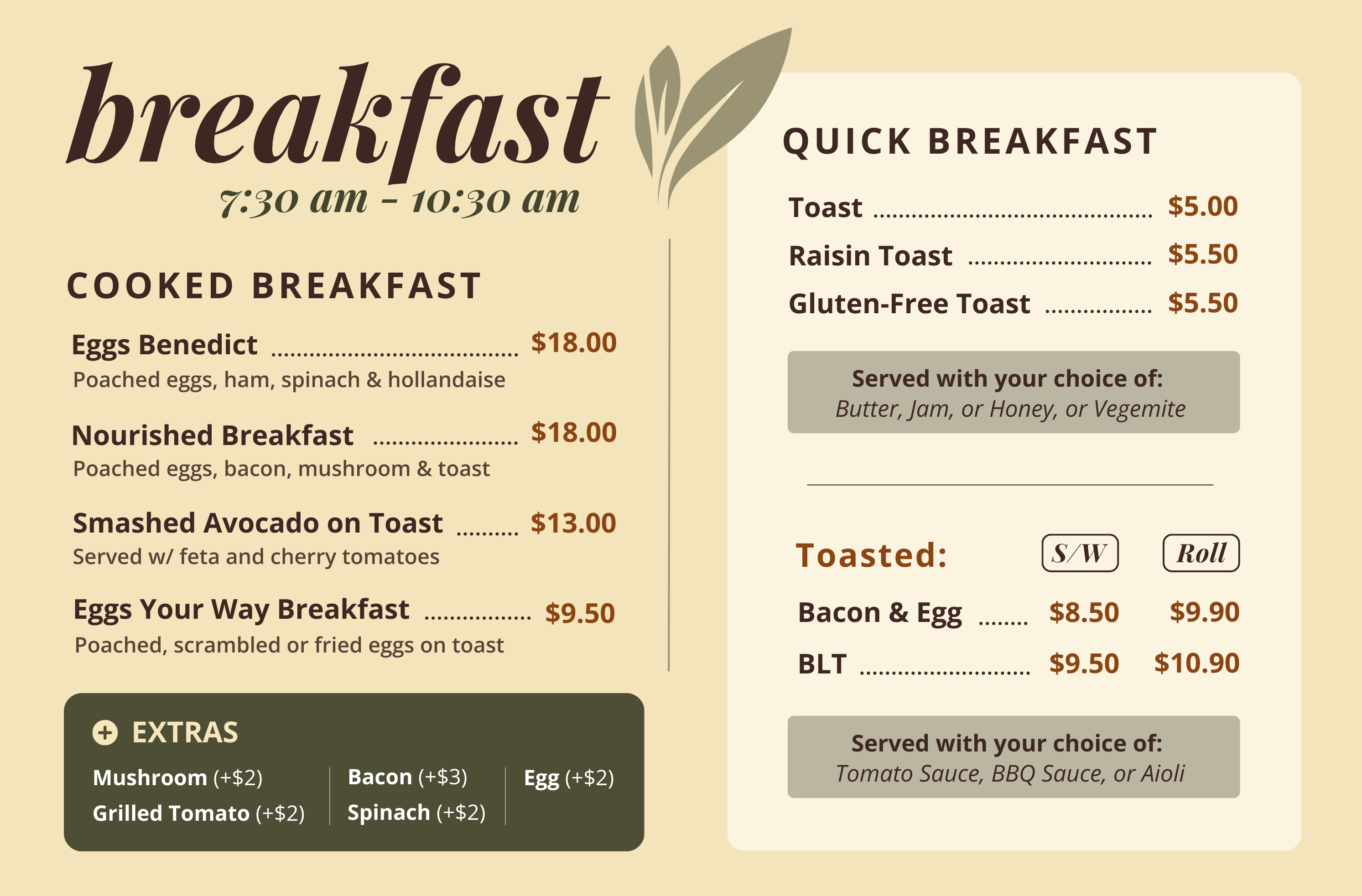
Brand repositioning and menu design for an Asian fusion cafe. A strategic pivot from aspirational health positioning to authentic "Comfort Food with Heart."

Client

Nourished Cafe

Location

Shenton Park, Perth

Timeline

Intensive 1-day

Iterations

4-5 rounds

Menu Design Visual

The Challenge

A brand at war with itself

Nourished Cafe is an Asian fusion cafe located within the Arthritis Foundation WA facility in Shenton Park. They came to me needing cohesive branding that reflected their offerings and customer experience.

The initial brief was straightforward: create a health-focused brand identity. The cafe's name suggested wellness. The location within a health facility reinforced it. The logical positioning seemed obvious.

But there was a problem.

The Contradiction

Customer research revealed a disconnect between the intended "health cafe" positioning and reality:

Coke fridge prominently displayed
Croissant combo deals featured
Indulgent comfort food options
Full range from healthy to treats

Attempting pure health positioning while selling Coke and croissants would undermine credibility.

What Google Reviews Revealed

I analysed their 4.8/5 star Google Reviews to understand what customers actually valued. The patterns were clear:

Personal Service

Maria's warm hospitality mentioned repeatedly. "Like visiting a friend."

Coffee Quality

William's barista expertise consistently praised. "Best coffee in the area."

Comfort Food

Customers came for comfort, not calories counted. "Soul food."

Convenient Location

Easy access and unique setting valued. "Hidden gem."

The Strategic Pivot

From aspiration to authenticity

Rather than forcing an aspirational health narrative that would ring hollow, I repositioned the brand around what customers actually loved. The pivot wasn't a failure of the initial approach — it was strategic responsiveness to reality.

Initial Direction

"Nourish Your Body"

  • - Health-focused positioning
  • - Wellness-oriented messaging
  • - Dietary accommodations front and centre
  • - Aspirational but inauthentic
Final Positioning

"Comfort Food with Heart"

  • + Honest about offering both healthy and indulgent
  • + People-focused (Maria & William)
  • + Community connection (Arthritis Foundation)
  • + Authentic differentiation
The cafe doesn't need to choose between health and comfort — their strength is offering both with genuine care and excellent service.

The core insight that unlocked the repositioning

The Solution

Brand strategy & visual identity

Four Value Propositions

01

Honest Choices

Quality ingredients with real options — healthy when you want it, indulgent when you need it.

02

Personal Touch

Maria's hospitality and William's coffee expertise. Real people, not corporate service.

03

Community Connection

Supporting Arthritis Foundation WA. Every visit contributes to something meaningful.

04

Versatile Service

Dine-in, takeaway, and catering for local businesses and universities.

Visual Identity System

Colour Palette

Sage Green

#7B9971

Fresh, welcoming, subtle health association

Terracotta

#C26B5C

Warm, comfort, Asian fusion aesthetic

Coffee Brown

#6B4C3A

Coffee expertise, earthiness

Design Approach

  • Modern minimalist (clean, not cluttered)
  • Vietnamese-inspired geometric patterns
  • Flat design aesthetic
  • High contrast for readability

Personal Touch Elements

  • "William's Pick" coffee recommendations
  • "Maria's Fave" menu highlights
  • Dietary icons (GF, V, Vegan)
  • Owner presence in brand story

Deliverables

Project outputs
Brand Strategy Documents

  • Comprehensive brand overview
  • Positioning statement
  • 4 value propositions
  • Target audience profiles
  • Brand personality guide
  • Messaging hierarchy

Visual Design Assets

  • Menu design (print-ready)
  • Colour palette system
  • Typography guide
  • Icon library (dietary indicators)
  • Signature badges and elements
  • Digital formats (web-ready)

Key Takeaways

What made this work

Research-Driven Decisions

Google Reviews analysis revealed what customers actually valued — not what we assumed they wanted. Data beat assumptions.

Willingness to Pivot

The major repositioning mid-project wasn't a failure — it was strategic responsiveness. Sticking with a flawed direction would have been the real failure.

Authenticity Over Aspiration

Positioning around genuine strengths (people, location, honest offerings) rather than aspirational claims that couldn't be supported. Authenticity builds trust.

People as Differentiators

Maria and William became the brand's authentic voice. Personal touches ("William's Pick", "Maria's Fave") created genuine differentiation competitors can't copy.

Skills Demonstrated

Brand Strategy Development Customer Research Strategic Repositioning Visual Design for Hospitality Menu Design Client Collaboration Multi-Format Delivery

More Work

Related projects

Start your project

Need brand strategy that's
authentically you?

Whether you're repositioning an existing brand or building from scratch, I'd love to help you find the story that's genuinely yours.